
Three hundred and sixty-five rows, eight colours, one year. Temperature blankets are a popular, and somewhat infamous project undertaken by knitters and crocheters alike, where a range of colour-coded yarn is used to mark the temperature each day of the year.
I think what makes temperature blankets so cool is how customizable they can be. You can do an infrared rainbow, neutrals, or whatever colours you feel like using. I’ve seen temperature blankets with borders, some with the average highs and average lows in each row, and some with the overall average temperature of each day. I’ve even seen a blanket with the hourly forecast represented (all the credit to Tiktok user Sweetly Stitches). There are so many ways you can make this massive project work for you.
When my husband and I moved to Leduc, I thought it would be awesome to have a blanket to forever document our first year here. I pulled together an array of colours from my stash and from the store, deciding on largely acrylic and wool worsted weight. My colour scheme is neutral at the middle of the spectrum with vibrant shades at the top and darker moody shades at the bottom.
And because I love data and am a sucker for a good spreadsheet, I worked my conditional formatting magic to plot out my blanket rows in Excel. My weather data is coming from a site called Visual Crossing, where I can pull extremely detailed statistics for free. It’s truly incredible.
I’m so proud of it, in fact, that I must share this screenshot:
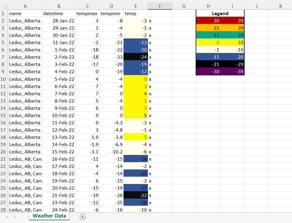
Isn’t it beautiful?
That is super cool! I will look forward to seeing the finished product next year! Very neat!
Do you chose the Color’s to represent temperatures? Big commitment on your part. Looking forward to progress reports.
Hi, Gramma! Yes, that’s correct 🙂 as you can see on my spreadsheet, each colour represents a temperature range